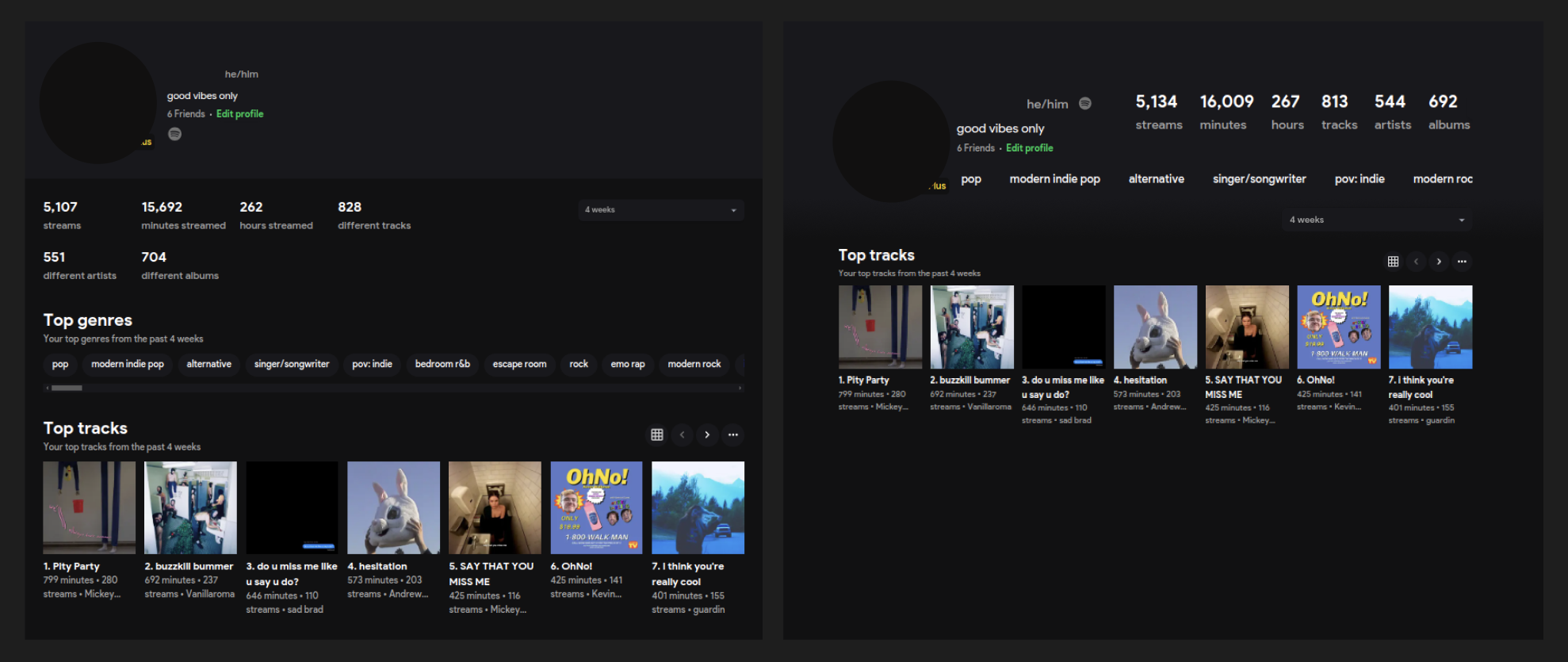
UI Redesign - Profile
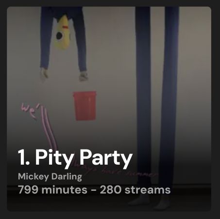
Tweaks to the Top Tracks carousel item, this would apply to tracks and albums.
|
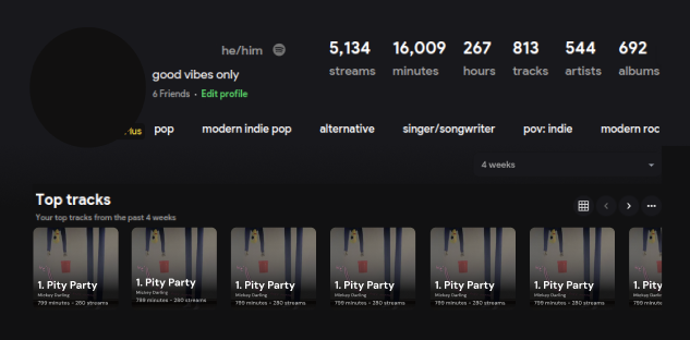
On hover: modal display of song or album preview
Border color by rank on leaderboard (1st, 2nd, 3rd), after that nothing... or green
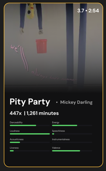
Audio Features in card could be swapped, or have three to four pages
Page 1 Vibe chart
Page 2 Musical information (loudness, key, mode)
Page 3 Vibe Chart
Page 4 Recent streams
Page 1/3 could be next to each other, OR consolidate the pages and have user click swap between the two chart types.. I am also not set on the order, users may want recent streams first.
Please authenticate to join the conversation.
Open
Feature Request 💡
Over 1 year ago

om3ga6400
Subscribe to post
Get notified by email when there are changes.
Open
Feature Request 💡
Over 1 year ago
om3ga6400
Subscribe to post
Get notified by email when there are changes.